Work / ToothGuard
ToothGuard
Finding a dentist is slow, opaque about cost, and, for a lot of people, frightening. ToothGuard is a dental-care assistant concept I researched, designed, and tested in my master’s program.
- Context
- Graduate project, University of Washington, 2024
- Role
- Research, concept, interaction design, testing
- Methods
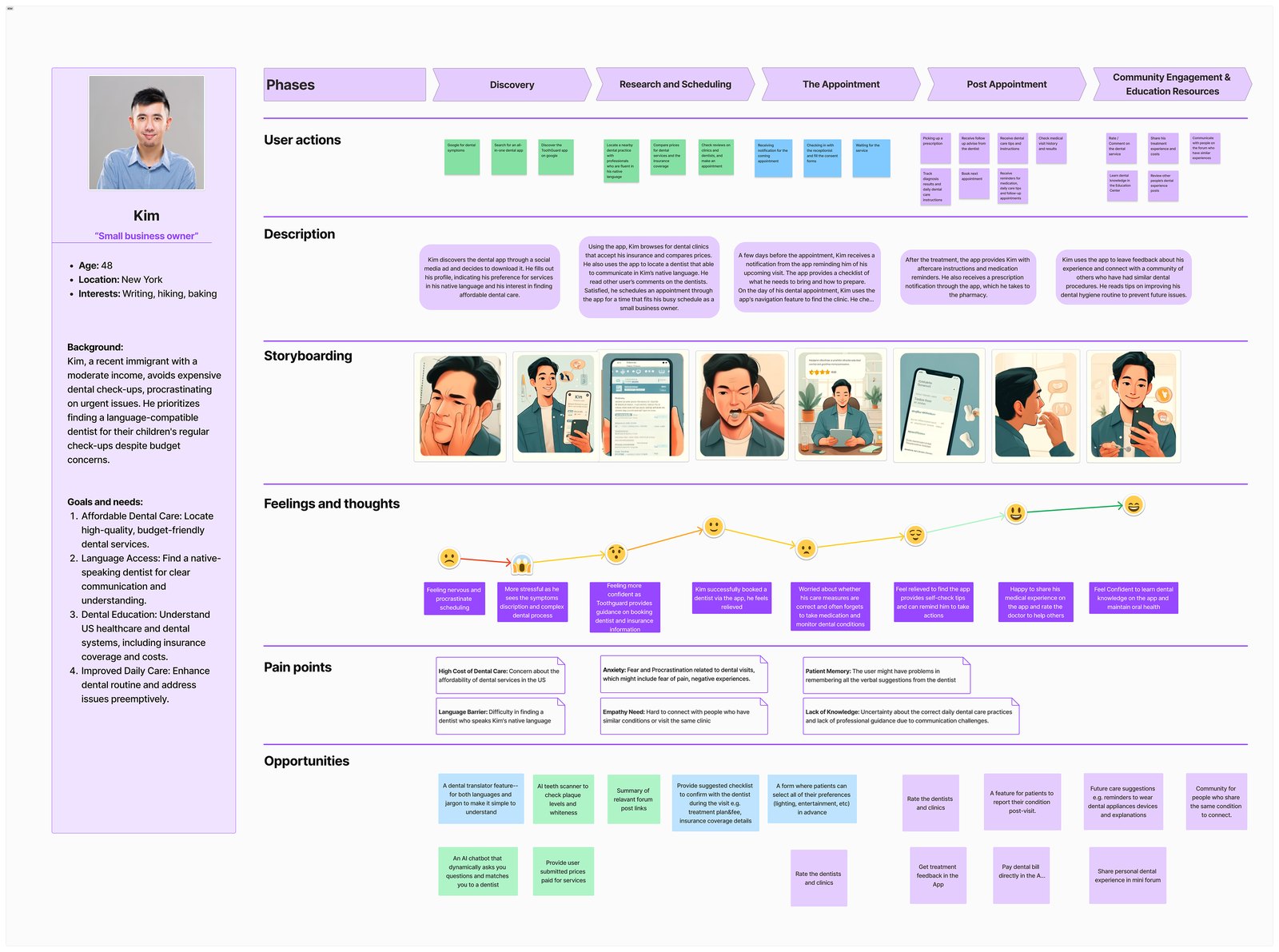
- User surveys, competitor analysis, literature review, personas, wireframes, focus groups, interviews
- Tools
- Figma, surveys, whiteboard sessions
The situation
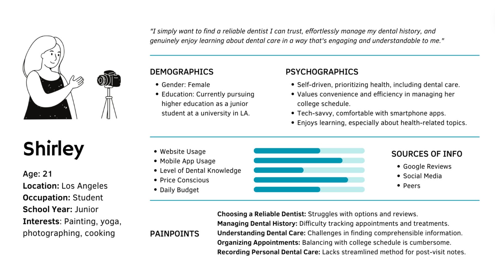
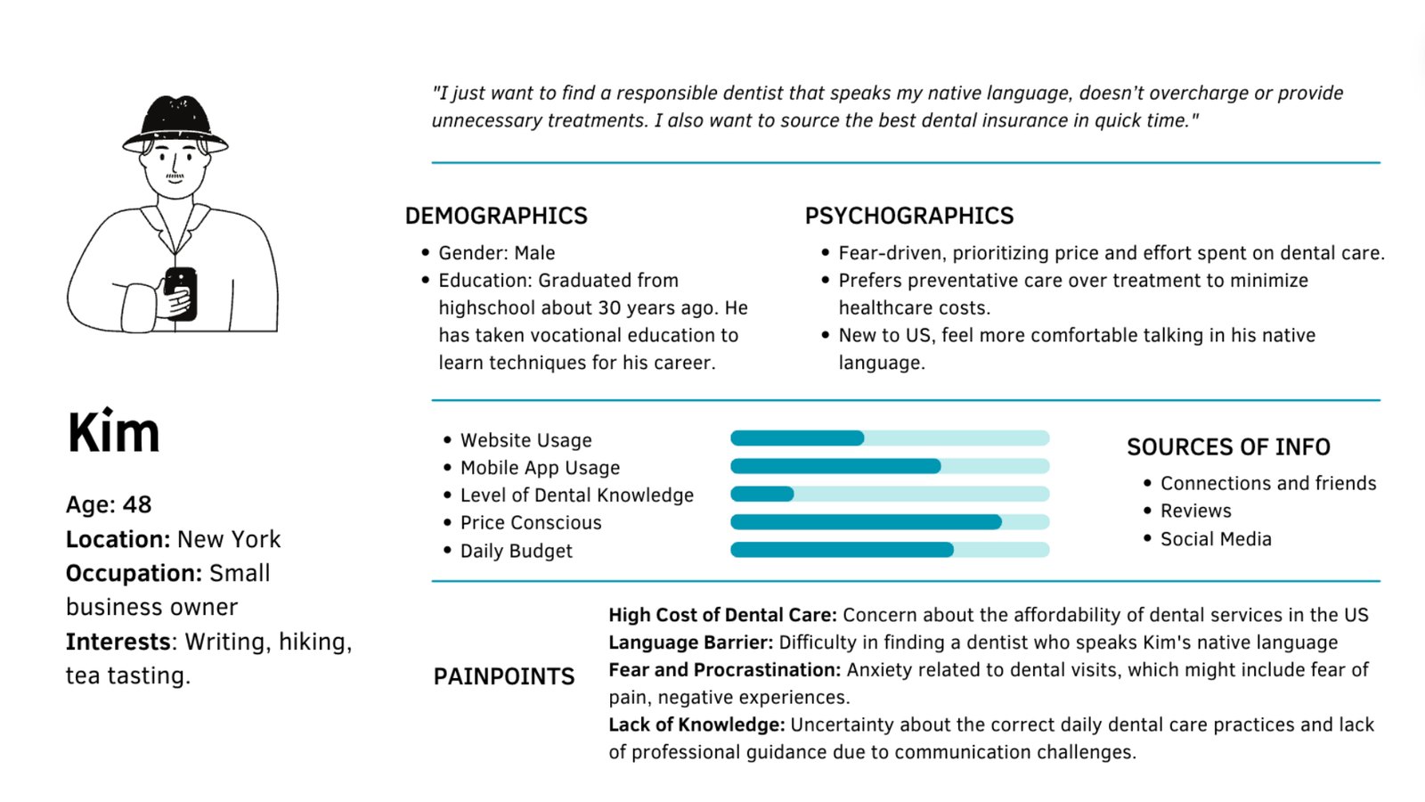
Surveys turned up the same four problems: nobody knows what a procedure will cost, especially without insurance; it’s hard to judge whether a dentist is any good; booking is a hassle; and there’s almost no plain-language education about what’s going to happen in the chair. Underneath all of it sits anxiety, which keeps people away until something hurts.
What I did
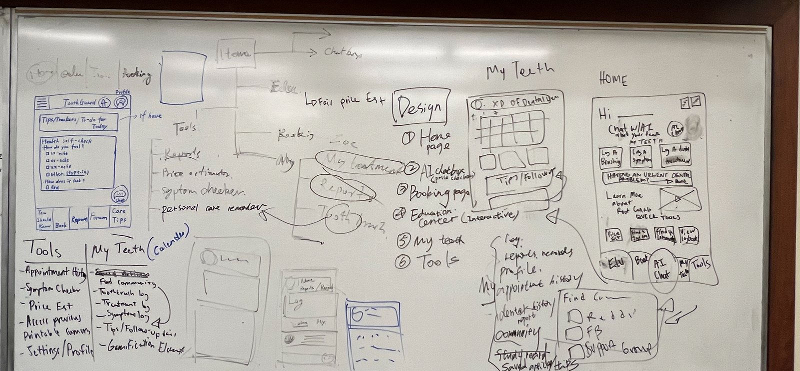
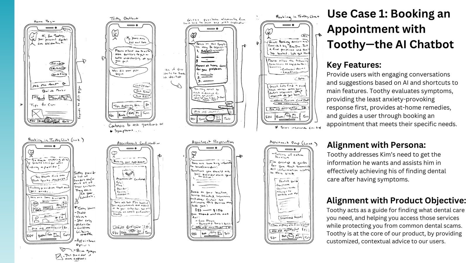
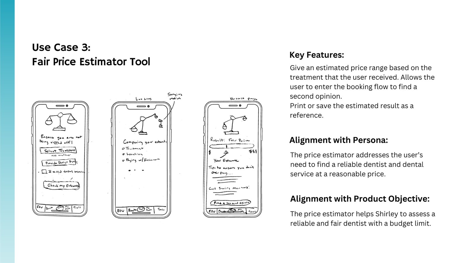
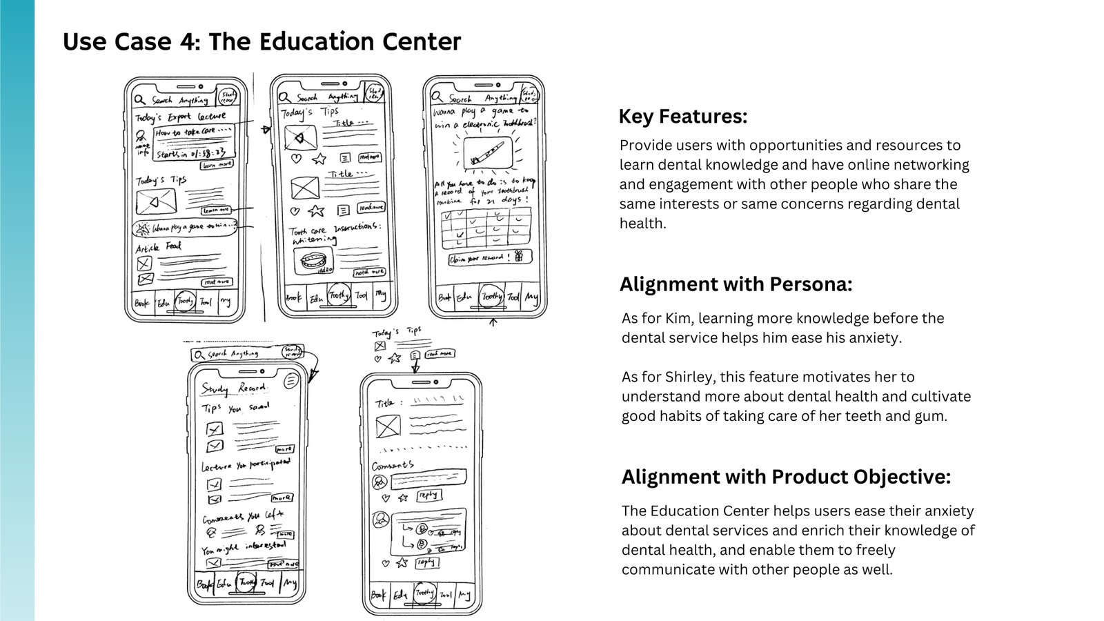
I compared existing options, ZocDoc in particular, and read the peer-reviewed work on dentist–patient communication and anxiety reduction. Then I ran whiteboarding sessions to settle the core features: a friendly assistant that answers questions, a price estimator, an education center, and appointment booking that integrates with what already exists rather than rebuilding it.
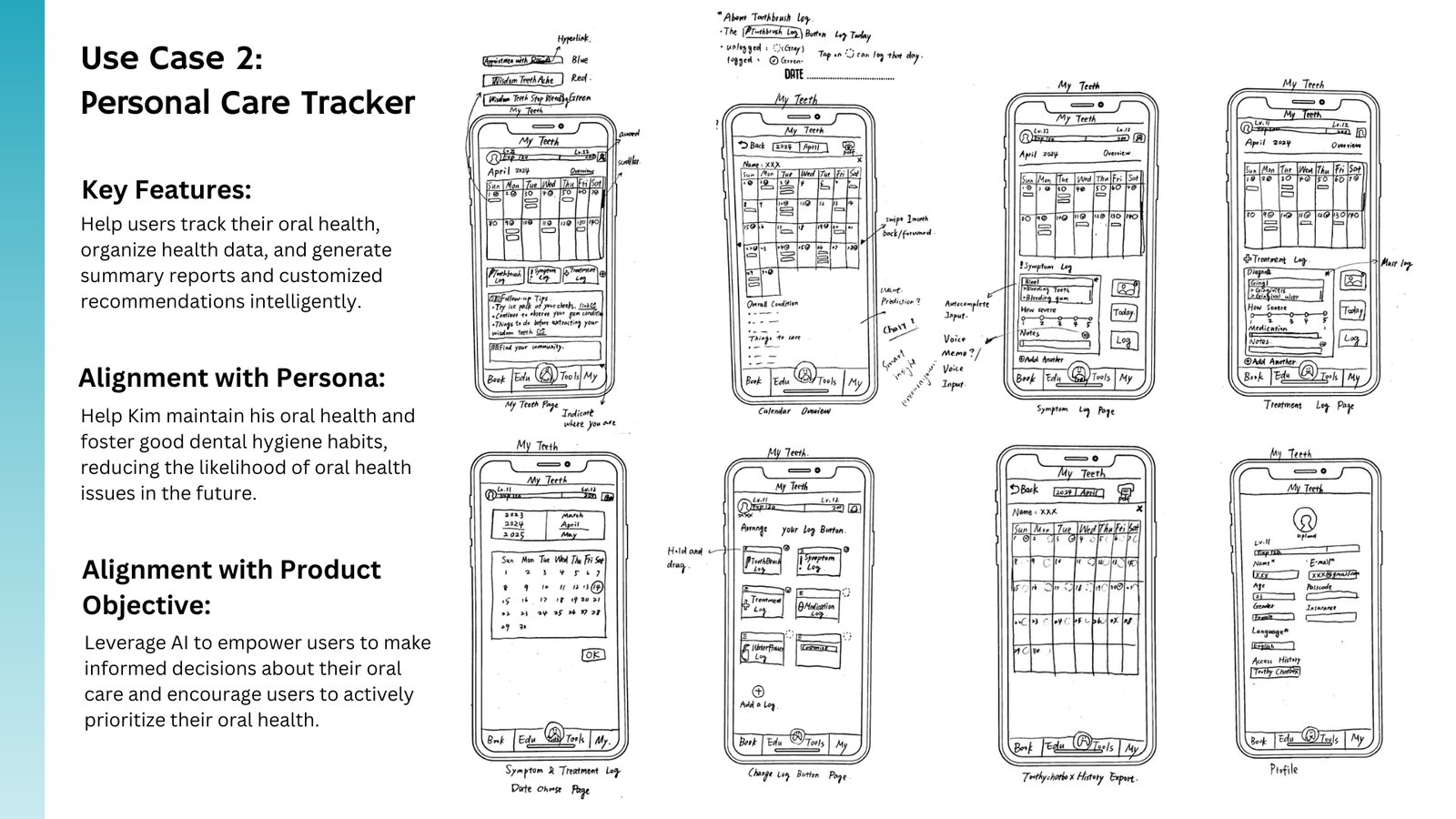
I designed the flows in Figma: a home screen with personalized widgets, the assistant, the price estimator, and the education center.
What came of it
Focus groups found the assistant on the home screen confusing, so I moved it. Interviews found an earlier version overwhelming, so I cut it down. Both rounds pushed me toward the same conclusion: changing how someone feels about the dentist matters more than how the app looks.
If the concept went further, I’d lean into the friendlier “Toothy” name, add short video introductions from providers, let people upload insurance cards, and personalize around dental history. All of that is on the list because users asked for it.