Work / Point-of-sale redesign
Point-of-sale redesign
Top Pot Doughnuts replaced its point-of-sale system, and the baristas couldn’t find anything on it. I audited the new system from behind the counter and redrew its information architecture.
- Organization
- Top Pot Doughnuts, Seattle
- Role
- Barista; led the UX evaluation
- Methods
- Content audit, stakeholder interviews, usability testing, tree diagram, tree test
- Result
- 30% less service time per transaction
The situation
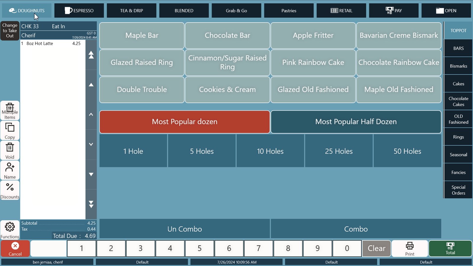
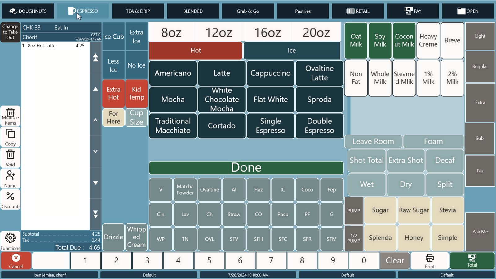
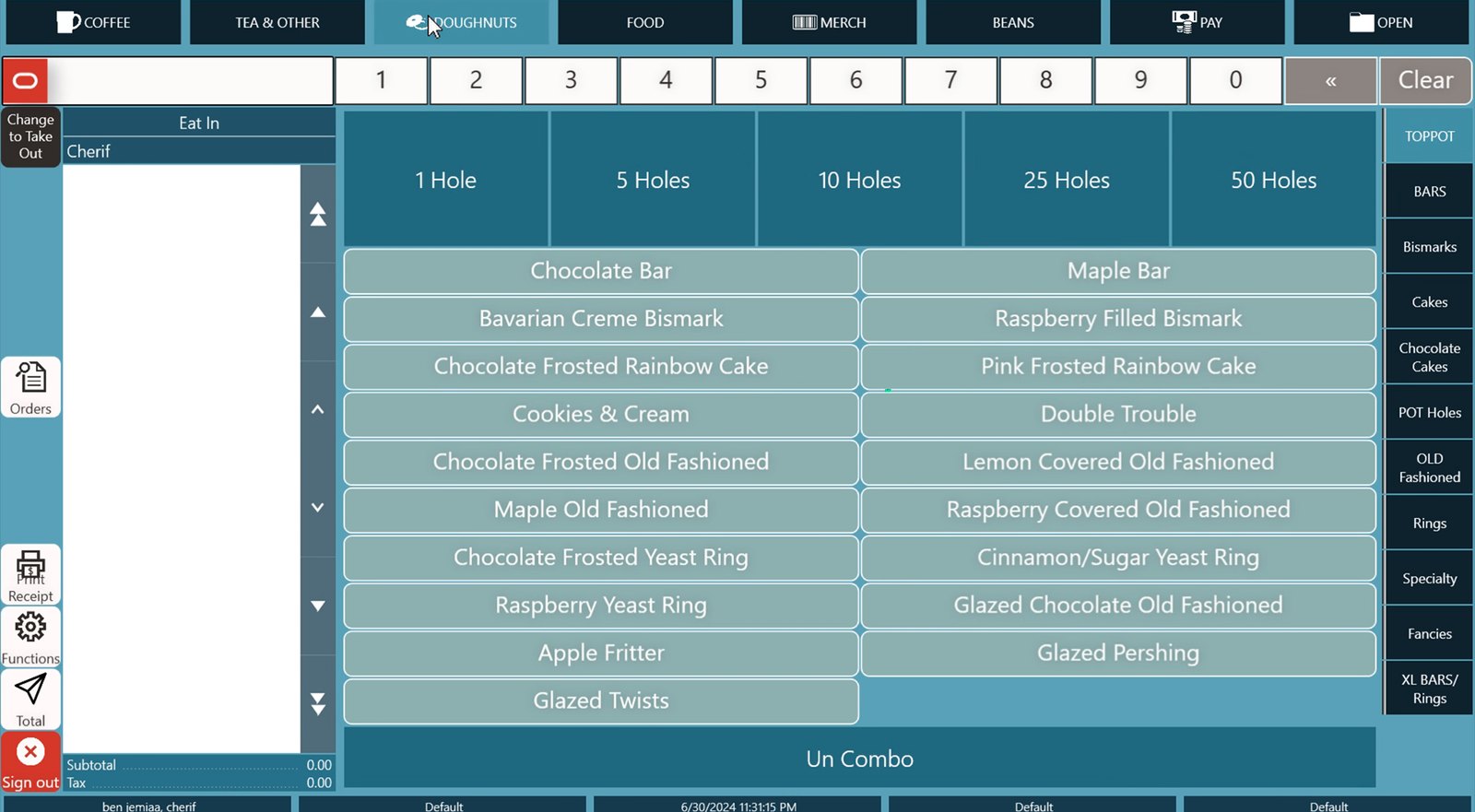
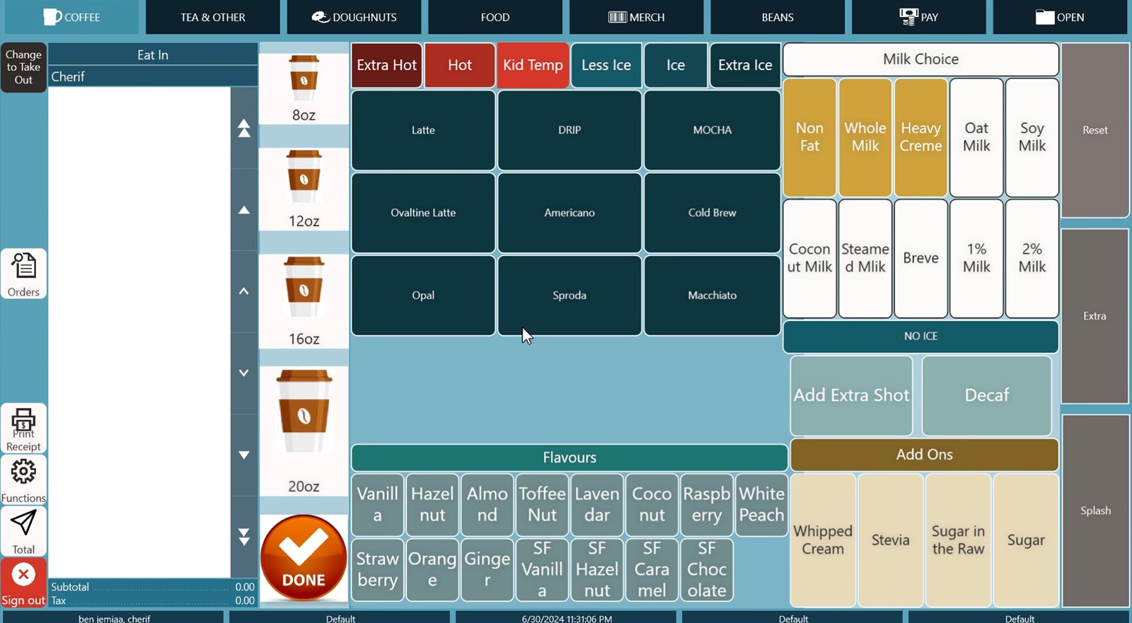
I worked the bar at Top Pot for five and a half years, running more than a hundred transactions a day. When the company moved from handwritten cup orders to a new point-of-sale with printed sticker labels, the machine asked baristas to enter far more data, and the layout didn’t match how anyone thought about the menu. Custom drinks were buried and doughnuts had no sensible grouping.
I audited the initial version before it rolled out to every store.
What I did
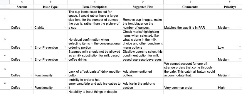
I documented every issue in a shared spreadsheet: which screen, what kind of problem, a plain description, a proposed fix, and a priority, so the operations team could work through it in order rather than all at once.
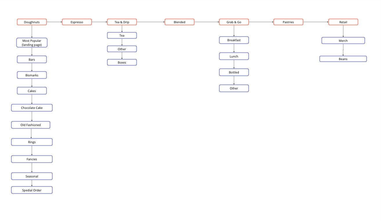
Then I interviewed stakeholders, watched staff use the system during real shifts, and redrew the whole menu as a tree diagram that matched how staff think: by what the customer asks for, in the order they ask for it.
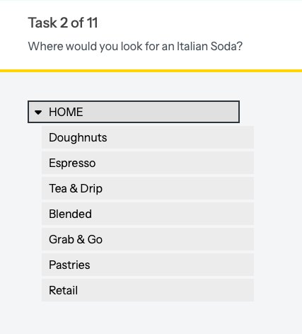
To validate the structure, I built a tree test in Optimal Workshop. The rollout timeline meant I couldn’t distribute it before launch, so the changes went in on the strength of the audit, interviews, and usability testing; the tree test never ran.
What came of it
Service time per transaction dropped about 30% compared with the old machine, even though staff were entering more information. I also wrote the training materials new baristas learned the system from, which might be the part I enjoyed most.