Summary: ToothGuard, also known as Toothy, is an all-in-one dental care assistant that aims to change the narrative and mental model people have of visiting the dentist. Instead of something potentially fearful, Toothy transforms the experience into something more playful, making dental care more approachable and less intimidating. Toothy offers a simplified and personalized approach to finding dental services, addressing challenges such as a lack of pricing transparency, difficulty finding reliable dentists, and managing ongoing dental health. The app leverages AI, in the form of "Toothy," to offer customized advice, ease patient anxiety, and help users make informed decisions about their oral health. It also encourages users to create and maintain healthy habits while making dental care more accessible and transparent.
The Challenge: Finding a dentist can be a time-consuming and frustrating experience. Users face issues like lack of pricing transparency, difficulty in assessing the quality of care, and anxiety about dental visits. Traditional appointment methods, like phone calls and emails, add unnecessary friction to the process. Moreover, there's a gap in accessible educational resources, which could help alleviate fears about dental procedures.
Personas:
Research:
User Surveys: Conducted to gather insights into user behaviors and preferences, focusing on how they find dental services, their priorities, and pain points.
Competitor Analysis: Analyzed existing solutions like ZocDoc to identify market gaps and opportunities for ToothGuard to differentiate itself. We focused on pricing transparency, user engagement, and personalized care.
Peer-Reviewed Research: Reviewed studies on dentist-patient communication, especially regarding challenges in reducing anxiety and understanding procedures.
Key Findings:
Pricing Transparency: Users, especially those without insurance, struggle to understand dental costs and need clear, upfront information.
Dental Anxiety: Anxiety prevents many users from visiting the dentist, highlighting a need for supportive resources to help reduce fear.
Information Overload: Users have difficulty finding reliable and concise dental care information. A streamlined approach to comparing dentists and services is needed.
Preference for Digital Solutions: Many users prefer finding a dentist online but are dissatisfied with the experience, which indicates a need for a more intuitive and transparent digital solution.
Results Analysis: The survey results showed that a significant portion of users are young adults, like Shirley, who prioritize convenience and long-term health, while others, like Kim, are more concerned about affordability and fear. These findings directly informed our product features, focusing on reducing friction, improving transparency, and offering emotional support.
Ideation & Design:
Crafting ToothGuard involved tackling a range of challenges to define our unique value proposition. We didn’t want to be a simple directory like ZocDoc or an electronic health records system like MyChart. Instead, we wanted to provide a more playful and approachable experience through Toothy, an AI that demystifies dental care. This unique positioning focuses on changing how people think about going to the dentist—from something they fear to something approachable and even fun.
Whiteboarding & Initial Concepts: We used whiteboarding sessions to explore ideas and determine our core features, including protecting users from unnecessary procedures, acting as a third-party advisor, and integrating educational tools. Integrating with ZocDoc for appointment scheduling allowed us to leverage an existing platform while differentiating ourselves.
Early wireframes helped map the core user journey, focusing on transparency, ease of navigation, and Toothy’s friendly AI support. The design aimed to make dental care more understandable and comfortable, primarily through Toothy’s engaging and supportive personality.


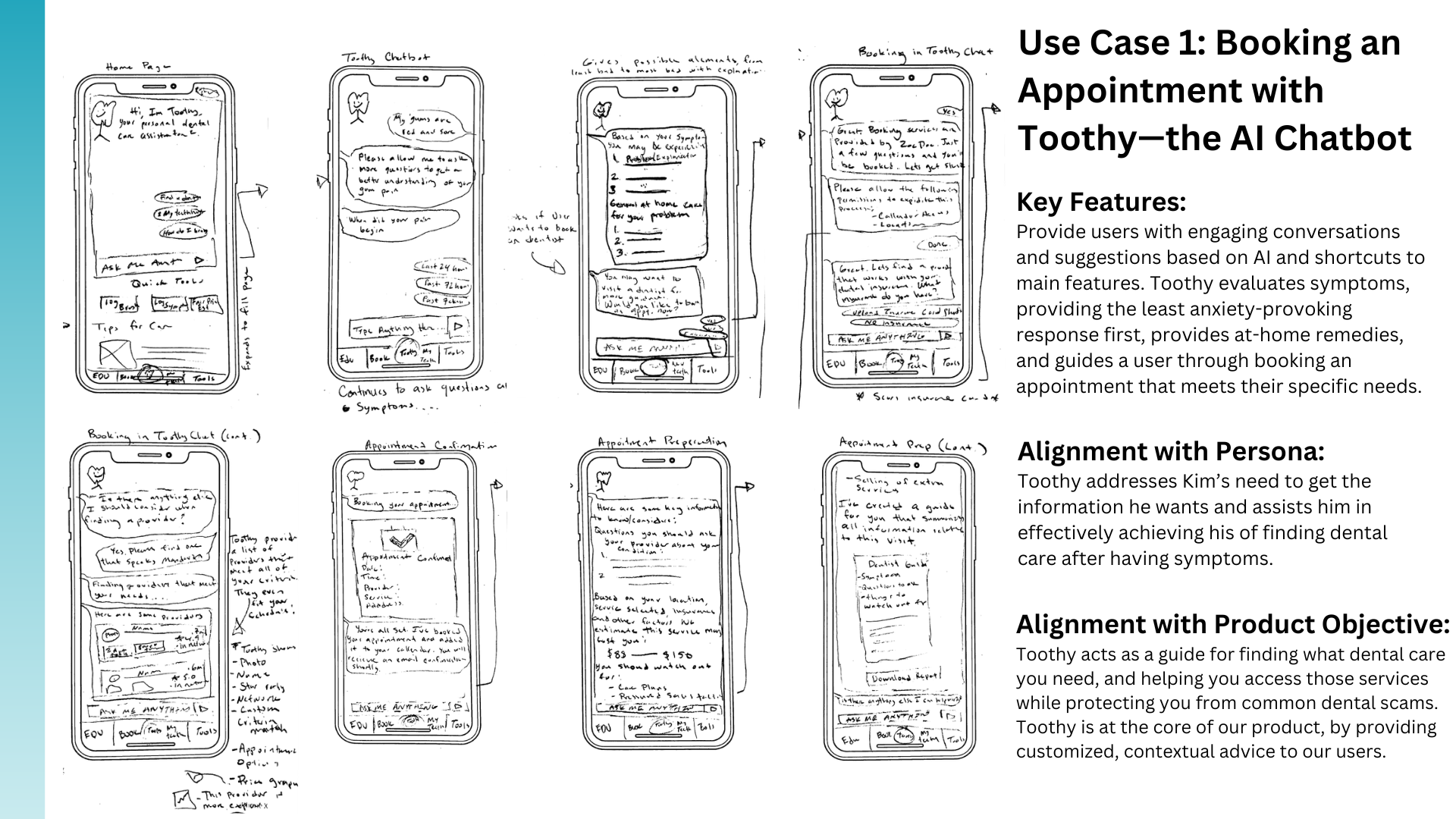
The user flow was designed to guide users from opening the app to booking an appointment seamlessly. Users start by setting their preferences (e.g., budget, location), and Toothy assists them in finding options. This flow minimized friction and enhanced user comfort by making the process simple and intuitive.
Final Design:
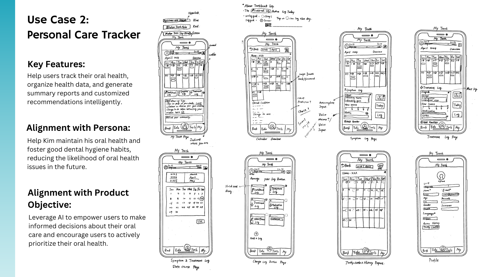
Home Screen: Featuring dynamic widgets tailored to the user, such as upcoming appointments and dental health tips.
Toothy AI Chatbot: Toothy provides instant support, answers questions, and helps users book appointments, acting as a friendly guide to reduce anxiety.
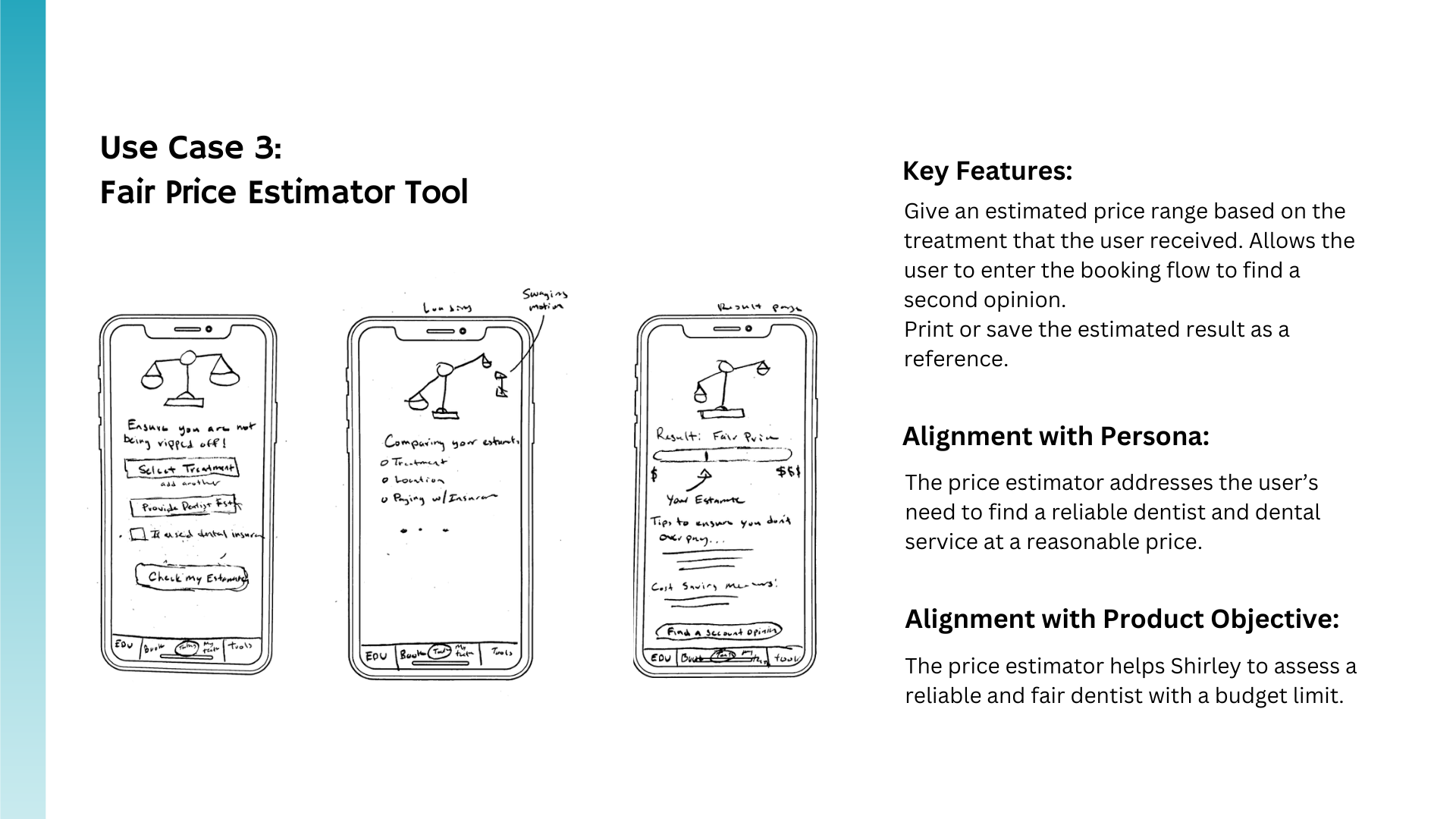
Price Estimator Tool: Users can receive cost estimates based on their dental needs, helping them make informed financial decisions.
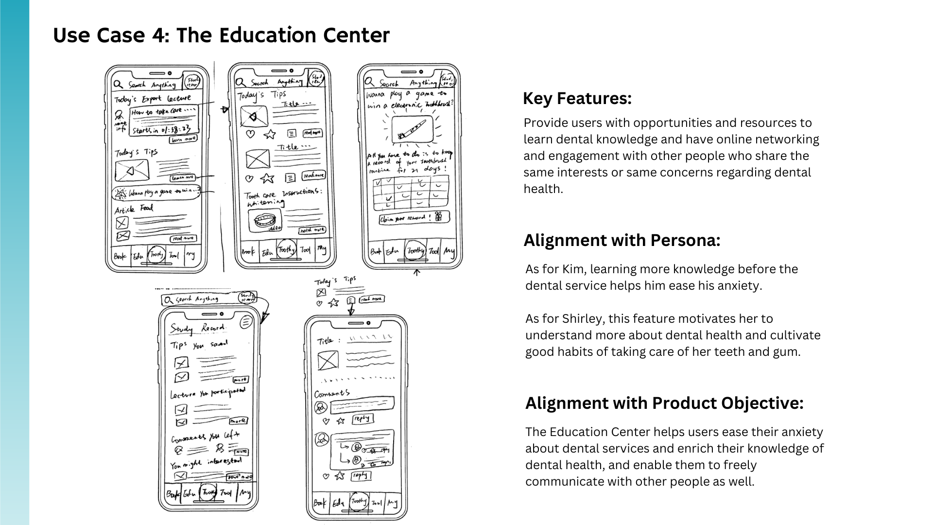
Education Center: Offers resources to help users understand dental procedures, empowering them and reducing fear.
Design Rationale: Each feature of Toothy was designed with user needs in mind:
Toothy AI Chatbot: Beyond cuteness, Toothy aims to shift the mental model of dental visits, making them feel more playful and less intimidating, ultimately changing how users think about dental care.
Price Estimator Tool: Addressed the need for transparent pricing, especially for uninsured users, enabling better decision-making.
Education Center: Empowered users by providing digestible information, helping them make confident choices.
Testing & Validation
Focus Group Insights: During focus groups, participants highlighted areas needing clarity, such as simplifying the chatbot’s presence on the homepage. This led to changes like repositioning Toothy to be less intrusive but more clearly defined as the primary interaction method.
User Interviews: Scenario-based tasks such as booking an appointment and using the price estimator highlighted pain points. Participants found earlier versions overwhelming, prompting us to simplify and enhance key flows to improve usability.
Key Learnings
Shifting Mental Models: Changing people’s thinking about dental visits was more impactful than merely making Toothy cute. It's about reframing an intimidating experience into something friendly and approachable.
User-Centered Experiences: Balancing practical and emotional needs is essential. Designing empathetically helps users feel understood and supported.
Iterative Feedback: Remaining flexible and simplifying design elements based on user feedback was key to ensuring a user-friendly experience.
Future Directions
Emphasize Toothy's Approachability: Further lean into the friendliness of Toothy to make it central to the user experience, potentially rebranding the app to "Toothy." The goal is to ensure users feel a sense of comfort and fun with dental care.
Introduce Short-Form Videos of Providers: Help users feel more comfortable by offering videos that let them see the dentist’s personality before booking.
Insurance Card Uploads: Allow users to upload their insurance card or employer benefits to quickly determine available coverage, simplifying the process.
Make Toothy Smarter: Increase Toothy’s personalization by leveraging user dental history for tailored guidance.
Incorporate Gamification: Use gamified elements to reward users for maintaining healthy dental habits, enhancing engagement and motivation.